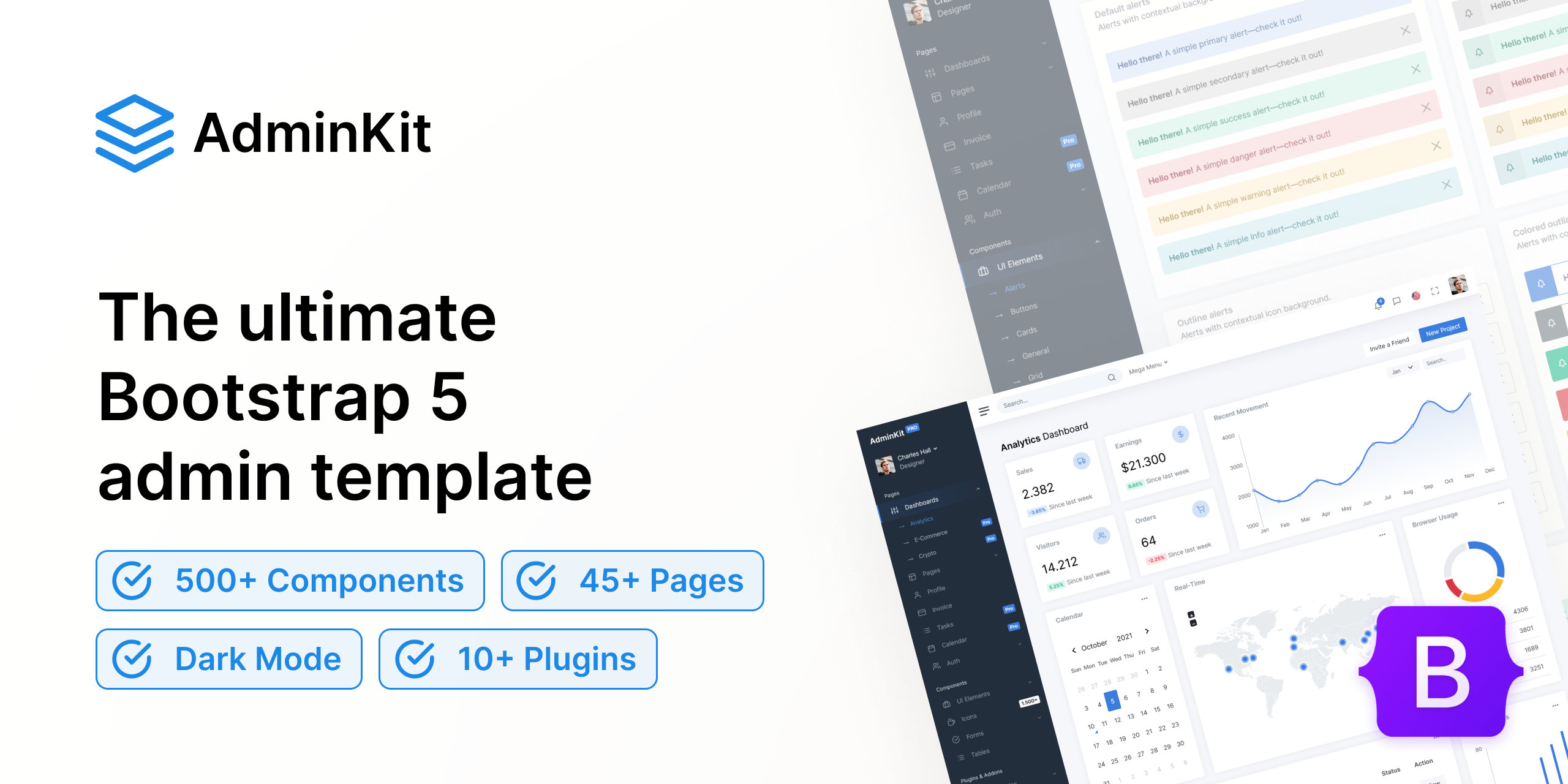
Bootstrap 5 has become the go-to front-end framework for web developers due to its ease of use, responsiveness, and flexibility. If you're looking to create a professional portfolio to showcase your work, Bootstrap 5 offers all the tools you need to build a stunning, mobile-friendly site. This guide will walk you through the process of creating a beautiful portfolio using Bootstrap 5.
Why Choose Bootstrap 5 for Your Portfolio?
Bootstrap 5 is ideal for portfolio websites because it provides:
- Responsive Design: Ensures your portfolio looks great on all devices.
- Pre-built Components: Quickly add navbars, cards, modals, and more.
- Customizable Layouts: Easily adjust and customize layouts to fit your style.
- Modern Aesthetics: Clean, modern design that enhances your portfolio's visual appeal.

Step-by-Step Guide to Creating Your Portfolio
1. Setup and Installation
First, set up your project by including Bootstrap 5 in your HTML file. You can use the CDN to quickly get started.
<!DOCTYPE html>
<html lang="en">
<head>
  <meta charset="UTF-8">
  <meta name="viewport" content="width=device-width, initial-scale=1.0">
  <title>My Portfolio</title>
  <link href="https://stackpath.bootstrapcdn.com/bootstrap/5.0.0-beta1/css/bootstrap.min.css" rel="stylesheet">
</head>
<body>
  <h1>Welcome to My Portfolio</h1>
  <script src="https://stackpath.bootstrapcdn.com/bootstrap/5.0.0-beta1/js/bootstrap.bundle.min.js"></script>
</body>
</html>
2. Create a Navigation Bar
A navigation bar helps visitors easily navigate your portfolio. Bootstrap 5 makes it easy to create a responsive navbar.
<nav class="navbar navbar-expand-lg navbar-light bg-light">
  <a class="navbar-brand" href="#">My Portfolio</a>
  <button class="navbar-toggler" type="button" data-bs-toggle="collapse" data-bs-target="#navbarNav" aria-controls="navbarNav" aria-expanded="false" aria-label="Toggle navigation">
    <span class="navbar-toggler-icon"></span>
  </button>
  <div class="collapse navbar-collapse" id="navbarNav">
    <ul class="navbar-nav">
      <li class="nav-item">
        <a class="nav-link" href="#about">About</a>
      </li>
      <li class="nav-item">
        <a class="nav-link" href="#projects">Projects</a>
      </li>
      <li class="nav-item">
        <a class="nav-link" href="#contact">Contact</a>
      </li>
    </ul>
  </div>
</nav>
3. Add an About Section
The about section introduces visitors to who you are. Use Bootstrap 5’s grid system to create a balanced layout.
<section id="about" class="container mt-5">
  <div class="row">
    <div class="col-md-4">
      <img src="your-photo.jpg" class="img-fluid rounded-circle" alt="Your Photo">
    </div>
    <div class="col-md-8">
      <h2>About Me</h2>
      <p>Write a brief bio about yourself, your skills, and your background. Keep it engaging and concise.</p>
    </div>
  </div>
</section>
4. Showcase Your Projects
Display your best work using Bootstrap’s card components. Each project can be represented with an image, title, description, and link.
<section id="projects" class="container mt-5">
  <h2>My Projects</h2>
  <div class="row">
    <div class="col-md-4">
      <div class="card">
        <img src="project1.jpg" class="card-img-top" alt="Project 1">
        <div class="card-body">
          <h5 class="card-title">Project Title 1</h5>
          <p class="card-text">Brief description of the project.</p>
          <a href="project1-link" class="btn btn-primary">View Project</a>
        </div>
      </div>
    </div>
    <div class="col-md-4">
      <div class="card">
        <img src="project2.jpg" class="card-img-top" alt="Project 2">
        <div class="card-body">
          <h5 class="card-title">Project Title 2</h5>
          <p class="card-text">Brief description of the project.</p>
          <a href="project2-link" class="btn btn-primary">View Project</a>
        </div>
      </div>
    </div>
    <!-- Add more projects as needed -->
  </div>
</section>
5. Include a Contact Form
A contact form allows potential clients or employers to get in touch with you. Bootstrap 5’s form components make it simple to add a professional-looking form.
<section id="contact" class="container mt-5">
  <h2>Contact Me</h2>
  <form>
    <div class="mb-3">
      <label for="name" class="form-label">Name</label>
      <input type="text" class="form-control" id="name" required>
    </div>
    <div class="mb-3">
      <label for="email" class="form-label">Email address</label>
      <input type="email" class="form-control" id="email" required>
    </div>
    <div class="mb-3">
      <label for="message" class="form-label">Message</label>
      <textarea class="form-control" id="message" rows="3" required></textarea>
    </div>
    <button type="submit" class="btn btn-primary">Submit</button>
  </form>
</section>
6. Enhance with Custom CSS
While Bootstrap 5 provides a great starting point, custom CSS allows you to personalize your portfolio further. Adjust colors, fonts, and spacing to match your personal brand.
/* Custom CSS */
body {
  font-family: 'Arial', sans-serif;
}

h1, h2 {
  color: #333;
}

.navbar {
  margin-bottom: 50px;
}

#about img {
  width: 100%;
  max-width: 200px;
}

.card-title {
  color: #007bff;
}
7. Optimize for Performance and SEO
Ensure your portfolio is optimized for performance by compressing images and minifying CSS/JS files. Use descriptive meta tags to improve SEO.
<head>
  <meta charset="UTF-8">
  <meta name="viewport" content="width=device-width, initial-scale=1.0">
  <meta name="description" content="A professional portfolio showcasing my projects and skills.">
  <title>My Portfolio</title>
  <link href="https://stackpath.bootstrapcdn.com/bootstrap/5.0.0-beta1/css/bootstrap.min.css" rel="stylesheet">
  <link rel="stylesheet" href="styles.css">
</head>
Conclusion
Creating a stunning portfolio with Bootstrap 5 is straightforward and efficient. By following these steps, you can build a professional, responsive, and visually appealing portfolio that highlights your work and skills. Whether you’re a designer, developer, or any other professional, a well-crafted portfolio is essential in showcasing your capabilities and attracting potential clients or employers. Start building your Bootstrap 5 portfolio today and take your online presence to the next level.


